
Ranking the 2025-2026 NBA City Edition Jerseys
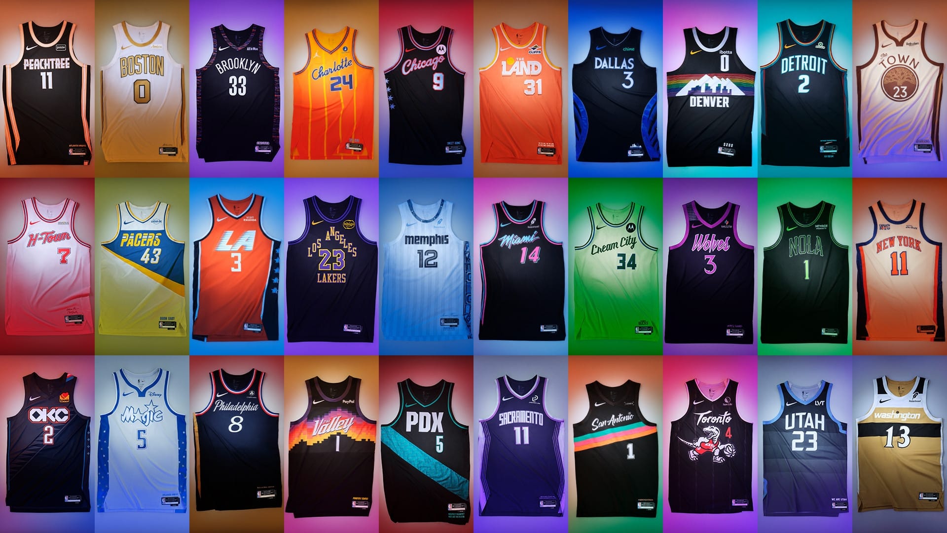
Because why not? First off, I should say that I love the City Edition jerseys as a concept. Some people have groused about them to me, and I see grousing about them in the media, like "why do we need so many jerseys?" But I like the fact that these are one and done, a new City Edition each season, and then they go away. It's a much better system than European soccer teams, who completely change each of their standard jerseys each year. The only thing that ends up being consistent on them is the sponsor logo splashed across the front, and the much smaller team crest, which absolutely sucks in my opinion. This is way more fun. We can have tradition and fun at the same time. The teams and Nike can be creative, without having to ruin the traditional/standard jerseys that they're going to wear for the lion's share of games. Here's a pic of all 30:
You can also see more details on them in this ESPN piece.
A lot of the rankings are obviously determined by my personal vibes, and I have to say I love most of these – I only really dislike a handful of these I have ranked in the bottom 10. But I do have some loose criteria – one, can I still instantly tell which team you are? As that is the main purpose of the uniform, I think it's kind of important. Another factor is whether we've seen the design before, and if that's exciting or not. Sometimes it is, sometimes it's tired. And then just fun. These are supposed to be fun. So let's have some fun! Fun is OK! So don't just stand there, let's get to it, strike a pose, there's nothing to it.
30th - Brooklyn: This team can't do anything right, so why not try to distract you by going back to the well of drafting off of Biggie? Except they've done this uniform before, and it's basically their normal uniform with the Biggie fringe around the side. Stop clinging to Biggie. He was the best, and you are the worst. You're basically dragging his name through the mud by associating it with your crap team. Enough.
29th - Dallas: Black and blue is always a bad combination in my opinion, and this is a lesson the Mavericks have failed to learn numerous times over the years. This looks like an old lettering design with some possible logo work happening on the sides. You can't even tell from the front. That's bad.
28th - LA Lakers: The Lakers wearing black always sucks, and I don't see the value in bringing back this stupid triangle design, like they're trying to make the "Los Angeles" look like the top of a house.
27th - Philadelphia: Basically a normal Philly jersey.
26th - Golden State: Basically their normal jersey but with muted/monochromatic colors. It fits because it makes them look old and they have an old-ass team, but otherwise it's pointless. And I hate the neckline. That neckline to me is arrogant. What is wrong with the normal jersey neckline?
25th - Washington: Basically their normal jersey but with different colors, and the gold looks like what a honey mustard packet would look like if you left it overnight and then weren't sure if you could use it again or had to throw it out.
24th - New York: This isn't even trying. This is basically their regular uniform with some added stripes down the side. It's the nuclear power plant Homer Simpson designed.
23rd - Boston: The gold is fun, but otherwise it's just the normal Celtics jersey. Everyone is terrified to make a truly original Celtics jersey. And they compounded this mistake by not putting any green on it – a shamrock near the bottom of the jersey would have sufficed – and now every time they wear it we have to hear about how it's the first-ever Celtics jersey without green on it.
22nd - Detroit: Some subtle stripes along the edges, but otherwise, not a lot happening here. I don't hate it, but...
21st - LA Clippers: I like the colors, but neither the colors nor the lettering remind me in any way, shape or form of the Clippers, and so this gets points taken off for confusion. Having just "LA" on the jersey doesn't help when another team in your league also uses "LA" in their name.
20th - Charlotte: Same deal here, though they get one spot up because there is only one Charlotte. Last night, I turned on Oklahoma City vs. Charlotte for a minute, because Charlotte was winning in the second quarter. I turned it off quickly after Shai Gilgeous-Alexander hit an absolutely perfect stepback three and I realized immediately that OKC was fine, but before I did, it took me a minute to figure out which team was which, since OKC also wears orange.
19th - Memphis: A slightly cleaner version of their normal jersey. I like it a lot, but there's not a ton of creativity here.
18th - Orlando: Ditto, but I like this one a little better, and the shorts complete the look. Too bad most people don't buy the shorts...
17th - Portland: I feel like we've seen this jersey before, or if not, all of its elements. Again, it's clean and looks good, but beyond that it's not enough. The blue pattern is apparently the same pattern of the original carpet at the Portland airport, which...OK?
16th - Sacramento: I like the purple on purple, but this has an argument to become their regular jersey, and it's a little disappointing that it isn't.
15th - Atlanta: I love this jersey, but there are so many black jerseys. I would have loved a version with the colors reversed.
14th - Phoenix: They've been wearing this jersey for a long time, and while it's always nice to have it, it's not a new design. And I like the black variant the least.
13th - Denver: Same here. I love this 80's design, and this is better than any of the Nuggets' normal jerseys (they have the worst collection of jerseys), but I always liked the white and blue variants better than this.
12th - New Orleans: This one is harder to judge, because I think the wearing of it in person would be cooler than how it is on the court. Like the neon, glowy part of it doesn't really show up under the incredibly bright lights of an NBA game. But in everyday life? Yeah, they'd be cool.
11th - Toronto: This would rank higher if the dinosaur was wearing this jersey on it, creating a little mirror effect. But it's not, so points taken off. I'm also less enamored with this old design than most, and the dinosaur is a little too big on the jersey for my taste.
10th - Utah: The blue on blue is dope, and I like the horizontal paneling on this. It's like their older more colorful one, which I liked, but a lot of people thought was too colorful. This one is cleaner.
9th - Cleveland: I love everything about this jersey except for that it says "The Land." I refuse to call Cleveland this, it's dumb. If not for that, this might be top three. Alas.
8th - Miami: A black variant of the Miami Vice jerseys. It's an awesome, awesome jersey, but again, I like the black variants the least.
7th - Chicago: Like their old 80s jerseys, but black. It's a tough look, but again, black variant.
6th - Indiana: It's a look they sported in the '90s, which I love. Refined classic.
5th - Minnesota: Five through two I could conceivably arrange in any order, I love them all a great deal. I put Minnesota here because they've worn this exact jersey before, and it's black, but it's still awesome. They designed it with Prince's estate a few years back. I think it's better than their normal jerseys.
4th - Houston: This jersey and the Minnesota jersey get what we'll call the "so fresh and so clean, clean" awards. Jerseys don't need to be showy to be awesome, and it is so much more fun to say "H-Town" than it is "Houston." Also, it reminds me of "Knockin' Da Boots," which can't possibly be a bad thing.
3rd - Milwaukee: I love these Cream City jerseys. We made baseball jerseys for the employees at the store that are very similar:
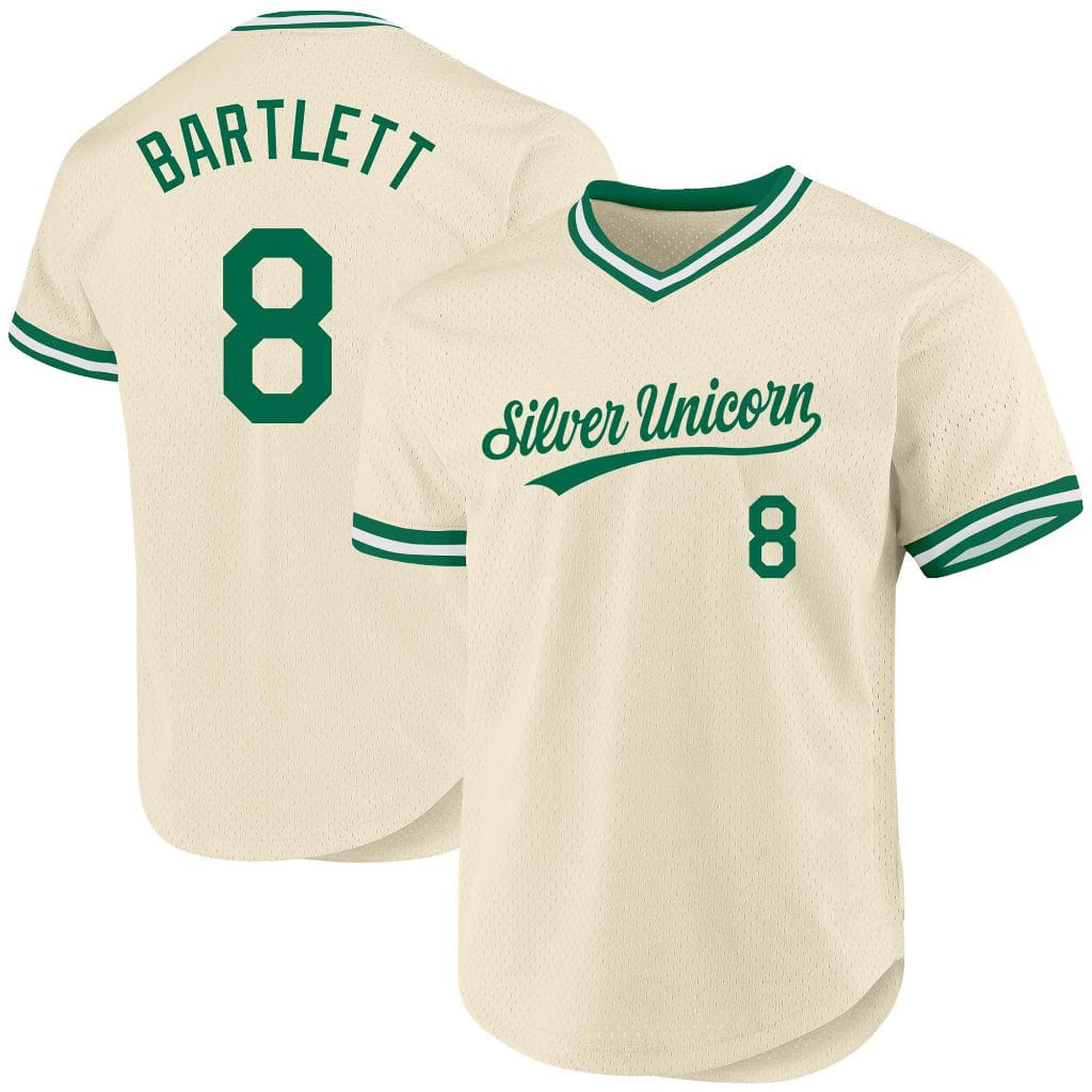
You can't tell really in the header photo, but they augmented this version a little with some light blue, which is a nice touch.
2nd - Oklahoma City: These are just awesome. The Indigenous touches are really great. And the diagonal stripes on the front make the jersey look like its flowing, and is just really chic. The darker blue is a much better color than their traditional bluer blue, which somehow is the most off-putting shade of blue. Like it's almost Carolina Blue but it isn't. Or possibly it's off-putting when paired with their orange? I can't say, but either way, this blue is better. And these say "OKC" instead of "Thunder," which is still one of my absolute least favorite team names. This jersey is a home run.
1st - San Antonio: Possibly the perfect jersey. It is vibrant and colorful even though it's also a black jersey. I used to have a David Robinson hat with this logo (I loved David Robinson), and I wore it all the time. How was it a "David Robinson hat," you ask? Because it had his signature on it. I'm pretty sure it was this hat. If not that, then something very, very, very similar to it. Anyway, I wore it relentlessly – so much so that the black eventually faded and became gray. I didn't care. This color scheme and jersey forever please.